Solar Icons: from Figma to web and mobile
Explore a maintained icon family across design files, web frameworks, server-rendered views and mobile applications.

Choosing an icon library involves more than finding a few symbols for a toolbar. Designers need an editable source. Developers need a package that fits their application. Both need to find the same subjects and agree on their appearance.
Solar Icons brings the Solar artwork by 480 Design into a maintained library with six visual styles, an icon explorer, a Figma file and packages for web, server-rendered and mobile applications. This guide walks through those entry points so you can evaluate the library against a screen you need to build.
Compare the visual family
Solar provides Linear, Outline, Broken, Bold, LineDuotone and BoldDuotone. The specimen below shows the same subject in each style, making the differences in geometry and visual weight visible together.
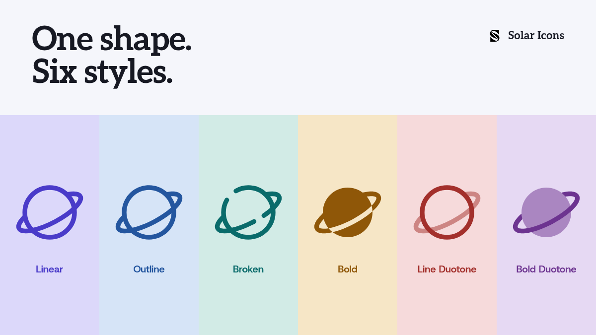
Linear uses open strokes. Bold fills more of the shape. The duotone treatments introduce a secondary opacity level. These choices let a team use the same icon family in interfaces with different visual needs.
Choose a treatment against a small inventory from your own product. A settings
screen might need user-circle, bell, shield-check, wallet and monitor.
Look for those subjects together, then check them beside their labels at the
sizes you intend to ship. For Appearance, a monitor suggests display preferences;
a moon would suggest a narrower dark-mode control.
You do not need to use all six styles in one interface. Start with a default, and introduce another treatment when it serves a clear role. A specimen helps compare the drawings; the screen you are building is where you judge the fit.
Use the maintained Figma file
The Solar Figma library puts the styles beside one another and provides main components you can use through instances in your copy. Local variables control icon color, live stroke width and duotone opacity.
Linear, Broken and LineDuotone retain editable strokes. Outline, Bold and BoldDuotone use filled geometry, so increasing stroke width does not apply to those shapes in the same way. Choosing Bold means choosing a different drawing, rather than thickening the Linear version.
Keep the icon's name and style in the handoff. For example, shield-check in
BoldDuotone identifies both the subject and the treatment.
The developer can then locate that combination in the package documentation.
A Community copy is a snapshot: it does not receive updates automatically. Return to the published file when you need the current library.
Pick the integration for your application
Solar provides framework packages rather than requiring a React layer for every project. The right starting point depends on where the interface renders.
For a React application, styles have their own import paths:
import { ShieldCheckIcon } from '@solar-icons/react/bold-duotone'

export function SecurityLabel() {
    return (
        <span>
            <ShieldCheckIcon size={24} /> Security
        </span>
    )
}
The React guide covers shared defaults, color, stroke controls and accessible labels. There are also dedicated guides for Vue, Nuxt, Svelte, Solid, Angular and React Native.
For a Laravel view, install solar-icons/blade through Composer. Blade Icons
components render inline SVG:
<x-solar-bold-duotone-shield-check />For a Rails view, the solar_icons gem provides a helper:
<%= solar_icon("shield-check", weight: "bold-duotone") %>These server-rendered integrations embed the artwork in the page; you do not need to introduce a JavaScript icon renderer for those views. Follow the Blade or Rails guide for installation, sizing and configuration.
Flutter applications can use flutter_solar_icons.
Blazor applications can use SolarIcons.Blazor.
For framework-free use, the static package
provides SVG assets and a sprite.
The artwork belongs to the same family across these integrations. The APIs follow their respective ecosystems: a React prop, a Rails helper option and a Flutter widget argument are not interchangeable. Check the target guide instead of translating an example by guesswork.
Check the fit before adopting it
Use a small inventory from your own product. Include navigation, a few actions and the domain-specific subjects you cannot replace with a generic symbol. Compare them together at the sizes you plan to ship. Keep visible labels where the meaning of a symbol could be ambiguous.
Then check the integration you will use. Confirm the icon name, the style and any customization the design requires. An adjustable stroke is relevant to the stroke-based styles; duotone introduces its own color and opacity choices. Testing that small set gives you a more concrete basis for adoption than a catalogue count alone.
Solar credits 480 Design for the original artwork. Those icons and corrections retain CC BY 4.0; new original additions and package code use MIT. Read the licensing guide when deciding how to use and credit the assets in your project.
Explore Solar Icons and find the subjects for your interface.